Lending a new meaning to Hoops Capital Academy visual brand identity
I developed the next chapter of the Hoops Capital Academy brand by translating its strategic vision into a scalable visual identity system. Designed to reflect its mission of nurturing basketball talent from grassroots to professional leagues, the identity established a consistent visual language across digital, print, and merchandise. This strengthened the Academy’s credibility, inspired young athletes, and positioned it as a recognised pathway within Australia’s basketball ecosystem.
My Role: Brand Design System, Creative Direction


A far reaching impact that will reverberate in the basketball world
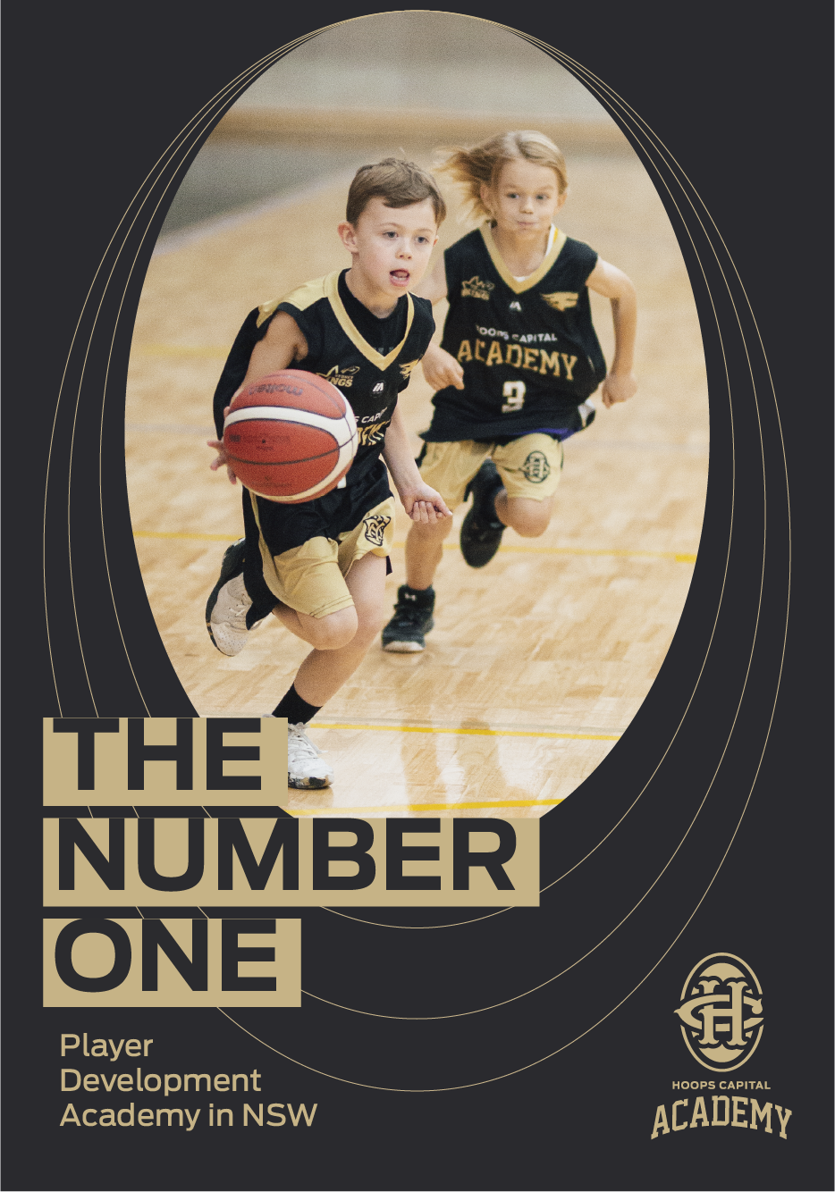
The addition of visual depth embodies the layers, resources, phases, and journey from initial steps to achieving the highest possible outcomes for aspiring basketball players at Hoops Capital Academy.


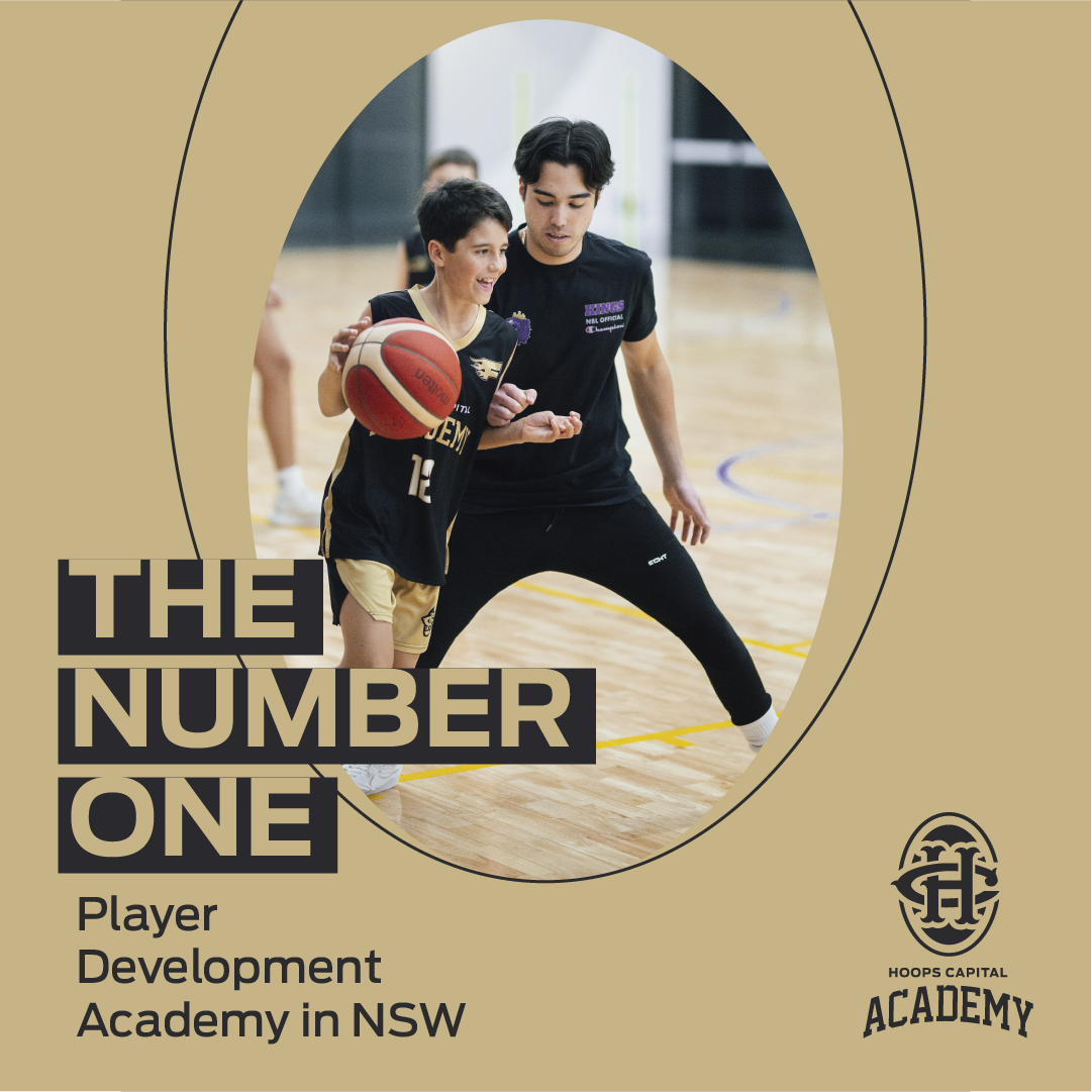
A minimalist look and feel that echoes through basketball arenas
A powerfully simple elliptical outline that symbolises the echoes of nurturing of grassroots and young talent at Hoops Capital Academy. This look and feel coexists with the layered graphical approach and imbues the brand with energy in addition to amplifying its significance.